Experiment Length:
Estimated Time: 3 days
Actual Time: 5 days
Summary:
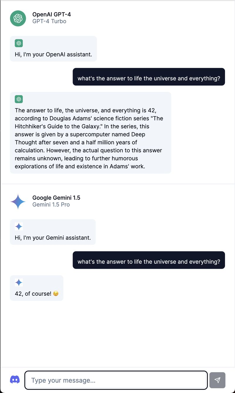
We aimed to make an interface for comparing responses from multiple AI models to enhance productivity in coding projects.
This was inspired when my collaborator Matt, mentioned that he manually inputs his coding questions into OpenAI, Anthropic, and Google models to triangulate the best answer.
Existing interfaces like OpenAI’s Completion interface display only a single model’s output, limiting direct comparison. Some platforms like chat.vercel.ai and chat.lmsys.org offer comparison between 2 models but the interface feels technical, i.e. is built for engineers and researchers. The websites are not particularly minimalistic or understandable to non-technical people.
This solution involved creating a super minimalistic interface that maximizes screen real-estate on both mobile and web devices, using ShadCN, Next.js, and TailwindCSS.
Plan:
We built the interface with API calls via the front-end and our own text streaming implementation.
The evaluation of the experiment’s success was based on the handwave-y measure of whether (1) the interface felt good to use and (2) Matt, my collaborator, is compelled to use it in the future for his coding tasks.
Results: 🟢 Pass
Matt was using this for his coding tasks already, halfway through the project! It certainly seemed useful at least for n=1.
The interface effectively came out very clean, fully utilizing screen space. Although initial brainstorming and development took longer than expected, the end result looked cute.
What I Learned:
It makes sense to start with a user base of n=1. This is a great guiding star.
I would’ve also started the project first with wireframes. This would’ve saved time.
Also, I enjoyed building a purely front-end application that had no need for a backend - this approach definitely saved time.
This post was generated by running my experiment notes through ChatGPT. This project was also in collaboration alongside Matthew Diakonov.